
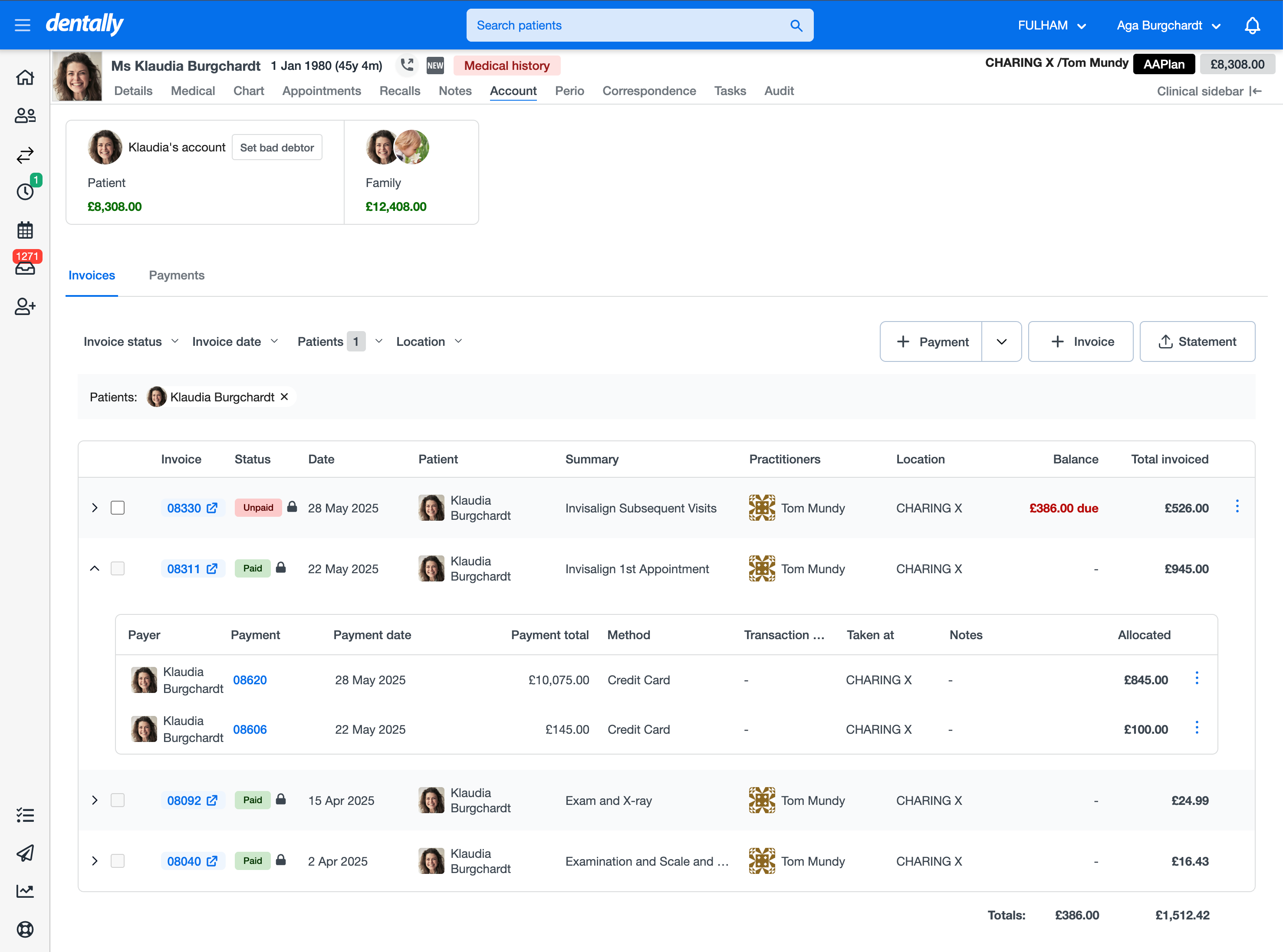
Hello. As the years are going by, the list of paid invoices on patients notes is getting longer and longer, meaning the location of the “Take Payment” button is moving further and further down the page.

My suggestion would be to move it to the top, near/next to the “New Invoice/Statement of Account/Bad Debtor” area.

I have mentioned this to my superiors in the past who have told me they have submitted it to Dentally but no changes as yet.

That’s a good suggestion and I’ve had this problem a few times now as well.  Moving of the button to the top should not be a massive reprogram either so should be relatively easy for them to do.  


Hi ​@DJmum & ​@BCDC2023,


Your timing is perfect because our design and product teams have already been working on exactly that update.


In the upcoming Account screen you’ll see the “Take Payment” button sitting right up at the top, alongside where you create new invoices and statements.

Here’s a sneak peek: as soon as we roll out Deposits, the “+ Deposit” button will appear right next to it.


New Account Screen


We’ll share more news as we get closer to release. In the meantime, let me know what you think of this change! 😊


Reply